CSS Media Queries
CSS Media queries allow you to target CSS rules based on - for instance - screen size, device-orientation or display-density. This means you can use CSS Media Queries to tweak a CSS for an iPad, printer or create a responsive site. Open the overview to see the complete list, and find for each media query if your browser applies these.
| Query | |
|---|---|
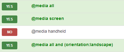
| YESNO | @media all |
| YESNO | @media screen |
| YESNO | @media handheld |
| YESNO | @media tv |
| YESNO | @media print |
| Query | |
|---|---|
| YESNO | @media all and (orientation:landscape) |
| YESNO | @media all and (orientation:portrait) |
| YESNO | @media all and (-webkit-device-pixel-ratio: 1) |
| YESNO | @media all and (-webkit-device-pixel-ratio: 1.5) |
| YESNO | @media screen and (device-width: 768px) and (device-height: 1024px) and (orientation:portrait) |
CSS Media Queries
Want to learn how to implement media queries? I'll explain what they are, how to use them and what each element does.
Online testing
Want to test your specific Media Queries? Try the new realtime testing tool! Copy paste your query, or use the tool to build them online.