Responsive adsense
Introduction
Started august 2013, Google has enabled responsive adsense banners. For now this is still beta.
Before this beta, Google didn't permit using CSS for responsive banners, and you had to create multiple adunits and target them using Javascript.
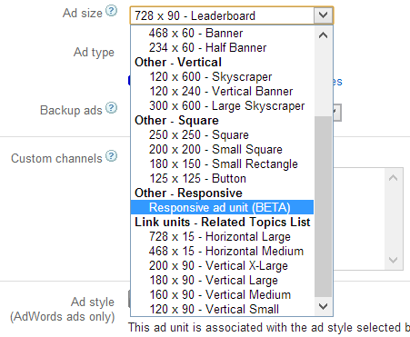
On google.com/adsense, go to My Ads, and create a new Ad Unit. On the ad sizes dropdown, you now can select a responsive ad unit.
Of course, CSSmediaqueries.com uses this type of banners right now.
As it is beta, there are a few notices:
- Be sure to specify fixed pixel values when setting the width and height of the ad to be served.
- Make sure that the specified width and height match one of our supported ad sizes. Please note that link unit sizes aren’t supported at the moment.
- The new ad code is responsive on initial page load only. Subsequent changes to the ad size, such as a screen orientation change, will not cause a new ad to be displayed. We know that this is an important feature for many of you and we’re currently working to address this.
- Always set a default ad size in case some media queries aren’t supported.

Implementation
The code generated looks like this, and gives us plenty of opportunity to tweak the layout to our wishes.
    <style>
      .cssmq-responsive { width: 320px; height: 50px; }
      @media(min-width: 500px) { .cssmq-responsive { width: 468px; height: 60px; } }
      @media(min-width: 800px) { .cssmq-responsive { width: 728px; height: 90px; } }
    </style>
    <script async src="http://pagead2.googlesyndication.com/pagead/js/adsbygoogle.js"></script>
    <!-- CSSMQ responsive -->
    <ins class="adsbygoogle cssmq-responsive"
         style="display:inline-block"
         data-ad-client="ca-pub-XXXXXX"
         data-ad-slot="YYYYYY"></ins>
    <script>
    (adsbygoogle = window.adsbygoogle || []).push({});
    </script>
Read more about this on the Google Inside AdSense Blog


